



We’d love to hear from you — whether you have a project in mind, or just want to say hi.
hi@bungee.io
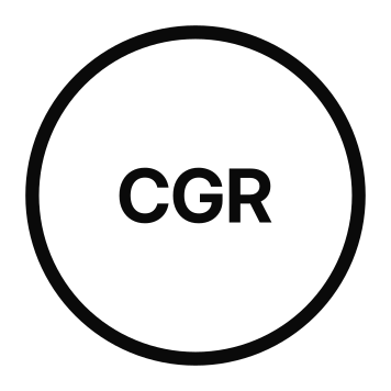
Brand architecture that became the foundation for the Recording Academy's unified identity, designed and rolled out with Siegel+Gale across every program, from MusiCares to the P&E Wing, to the GRAMMY Museum.
Applied end to end: logo, typography, color, OOH , digital, and mobile.
Challenge: Everyone knows the GRAMMYs but almost nobody knew the parent company behind it: the Recording Academy. Or MusiCares, the GRAMMY Museum, P&E Wing, and the advocacy work the organization powers. 6 decades of growth had left it a tangle of logos and an outdated, black-and-white identity that felt nothing like the music it champions.
Idea: Fix the foundation, then modernize everything on top of it. I owned the brand architecture: defining how the master brand relates to every sub-brand, unifying the system so each program clearly ladders up to the parent (so MusiCares reads as "Recording Academy, MusiCares," not a disconnected orphan), and making the strategic creative case that a brand about music should feel alive, fluid, vibrant, and inclusive rather than static and formal. That direction set the brief for the identity that followed.
Result: The Recording Academy carried that strategy into a full visual rebrand, designed and launched with Siegel+Gale, that finally looked like the music: color where there had been black and white, and a gramophone reimagined in both static and living form. It's strategic groundwork nobody notices when it's right but everybody can kinda feel when it's wrong.

For decades the Recording Academy lived in black and white: too formal, a little cold, and nothing like the music it exists to champion. The strategy we built made a simple case, that an iconic institution representing every genre and every kind of creator shouldn't hide behind one flat, monochrome mark. It should feel as varied and alive as the artists and music itself. That direction opened the door to a far more vibrant identity, full of color, and the logo reimagined as a fluid motion, and not something so static.
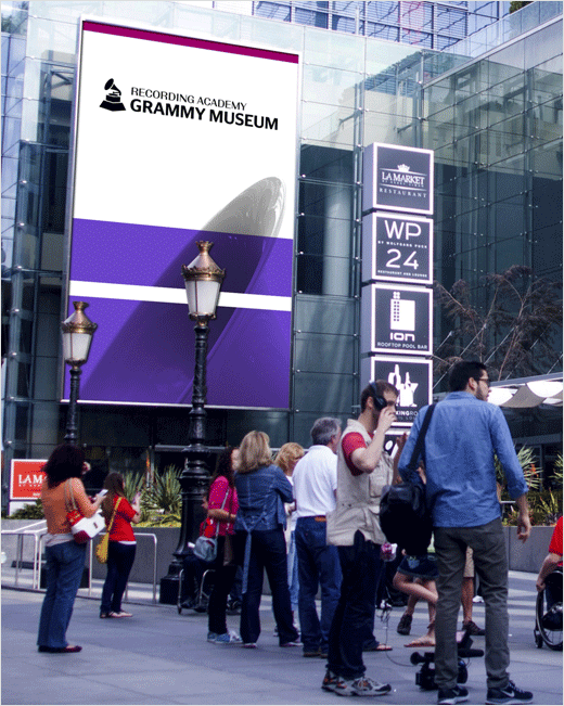


For most of its history the Recording Academy lived in formal black and white, elegant but cold, and nothing like the art is supposed to serve. The refreshed identity fixed that on every level: a palette of purple, blue, and turquoise gradients gave the brand the fluidity and vividness of music itself, with pops of distinct color held back for sub-brands like MusiCares so each keeps its own personality while still laddering up to the core parent brand.
The typeface shift moved from the old carved-in-stone Trajan to Francis Gradient, a high-contrast, all-caps sans-serif by Peter Biľak, something sharper, more modern, and more expressive, with the dramatic thick-to-thin strokes echoing the loud-and-soft dynamics of music notes. The iconic gramophone logo and TRA text, once a plain static icon, became a living one, rendered across colors and even animated so the letters stretch and compress to the actual rhythm of whatever music is playing. A logo that literally moves to the music felt about as on-message as an identity can get. Designed and launched with Siegel+Gale.